



Your Custom Text Here
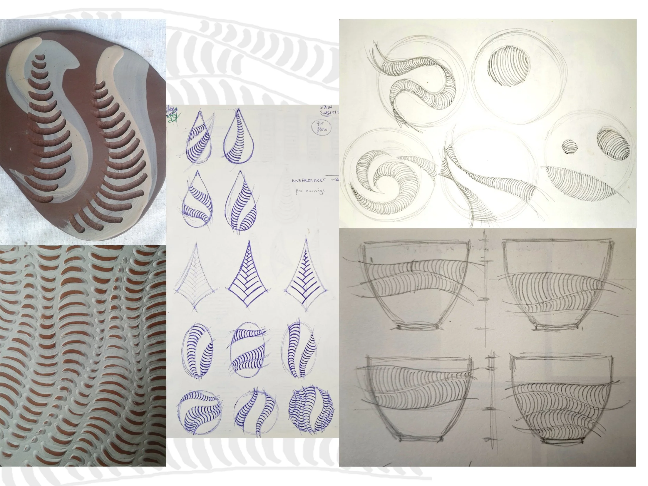
The story of these pots started with a visit to the Victoria and Albert Museum, back in 2013. There I saw a vase from the Fulham Pottery, decorated with lustre fish and waves: the design pushed me forward on a journey of playing around with lines and elements of its pattern. Traditional Hungarian shapes of folk pottery, and the dynamic but softly waving silhouettes of the country’s landscape, also provided me with beautiful and rich visual inspiration. The continuous, meandering line drawn by one generous movement of the hand creates the spine of my designs on each of my pots. Following the patterns of waves and fishbones, I scratch small parallel curved lines into the surface, organising them into rows above each other, creating waving and flow, and a bit of optical illusion.
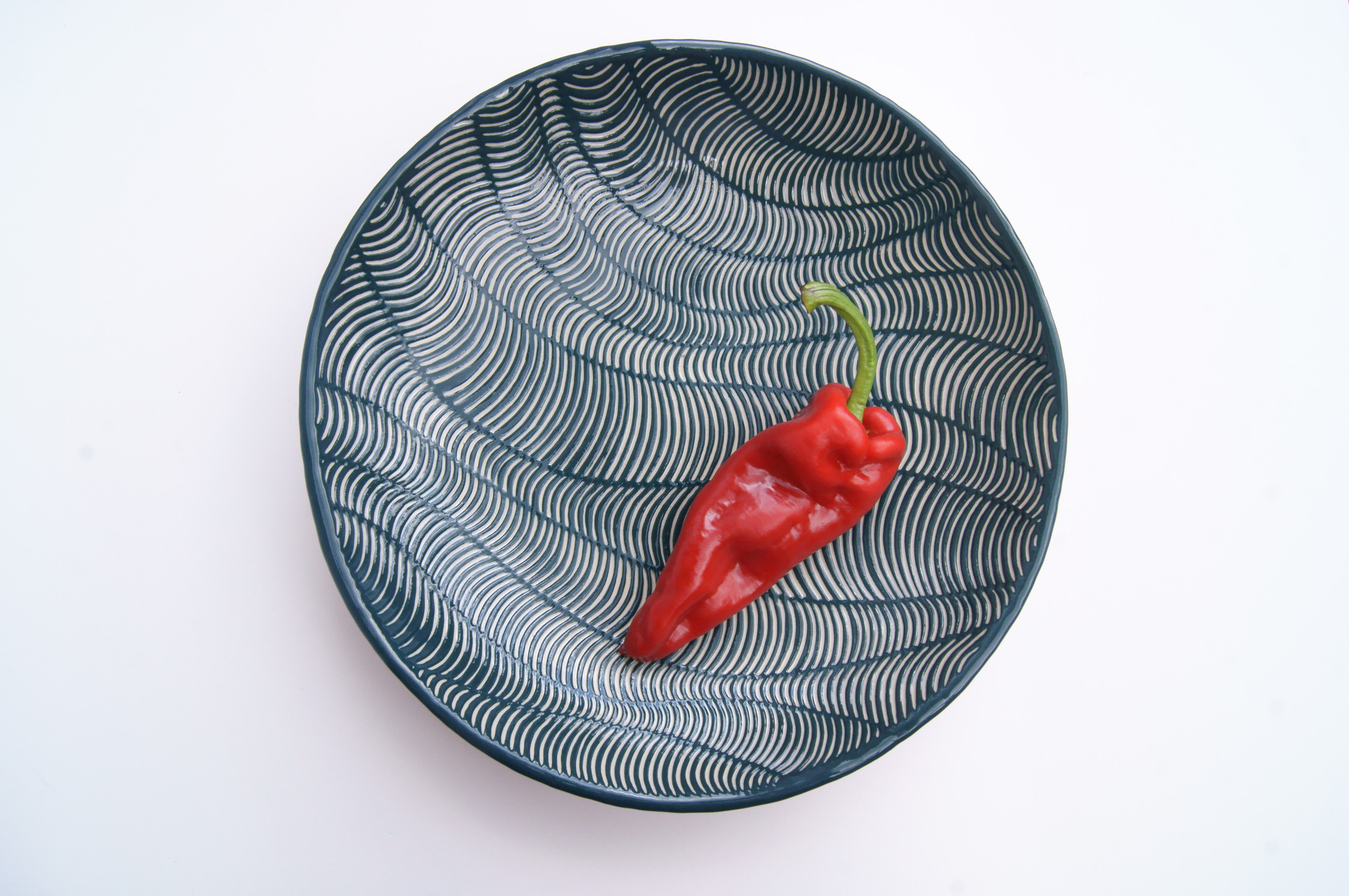
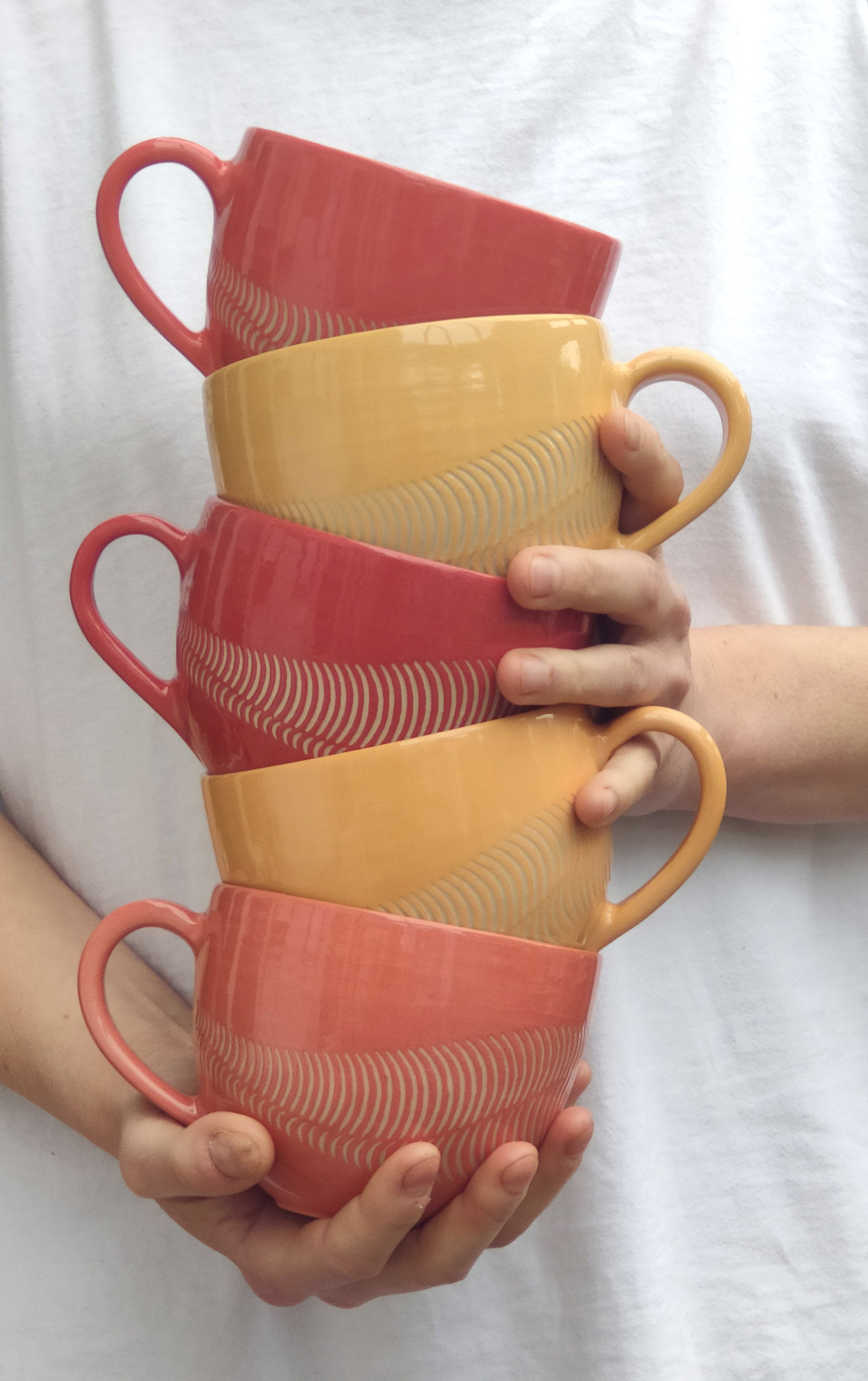
I work with two different colour palettes. The original one is very bright, very bold – white stoneware clay combined with saturated hues of blues, greens, reds, oranges and yellows glazed with a shiny transparent glaze. Here, the red-yellow shades are for drinking pots and dessert plates, and the darker blue-green range appears on the dinner plates; the reason for this separation is the relationship of the pot and the food which will be served in it. The dark bluish hues work particularly well with main courses and the cheerful reds are great with desserts or brighten the mood up in gloomy mornings when hot coffee is served up in them.
The second colour range is characterized by a neutral palette of strong, warm autumnal colours (browns, tans, buffs, muted reds and oranges) which are present both in clay body and decoration colour, derived from different oxides of iron. The clay is sandy, speckled and with its surface left unglazed and rough, it resembles rocks and the soil. This group of pots became a collection of their own, the Flow Rustics.
The story of these pots started with a visit to the Victoria and Albert Museum, back in 2013. There I saw a vase from the Fulham Pottery, decorated with lustre fish and waves: the design pushed me forward on a journey of playing around with lines and elements of its pattern. Traditional Hungarian shapes of folk pottery, and the dynamic but softly waving silhouettes of the country’s landscape, also provided me with beautiful and rich visual inspiration. The continuous, meandering line drawn by one generous movement of the hand creates the spine of my designs on each of my pots. Following the patterns of waves and fishbones, I scratch small parallel curved lines into the surface, organising them into rows above each other, creating waving and flow, and a bit of optical illusion.
I work with two different colour palettes. The original one is very bright, very bold – white stoneware clay combined with saturated hues of blues, greens, reds, oranges and yellows glazed with a shiny transparent glaze. Here, the red-yellow shades are for drinking pots and dessert plates, and the darker blue-green range appears on the dinner plates; the reason for this separation is the relationship of the pot and the food which will be served in it. The dark bluish hues work particularly well with main courses and the cheerful reds are great with desserts or brighten the mood up in gloomy mornings when hot coffee is served up in them.
The second colour range is characterized by a neutral palette of strong, warm autumnal colours (browns, tans, buffs, muted reds and oranges) which are present both in clay body and decoration colour, derived from different oxides of iron. The clay is sandy, speckled and with its surface left unglazed and rough, it resembles rocks and the soil. This group of pots became a collection of their own, the Flow Rustics.
Quisque iaculis facilisis lacinia. Mauris euismod pellentesque tellus sit amet mollis.